
Ohai!
I enjoy stumbling and making my way through css and pretend I know what I'm doing!
But I'm struggling sooo much with making templates properly mobile friendly.
Most of it I manage, adjusting width etcetc, but. I'm struggling like heck with the menus!
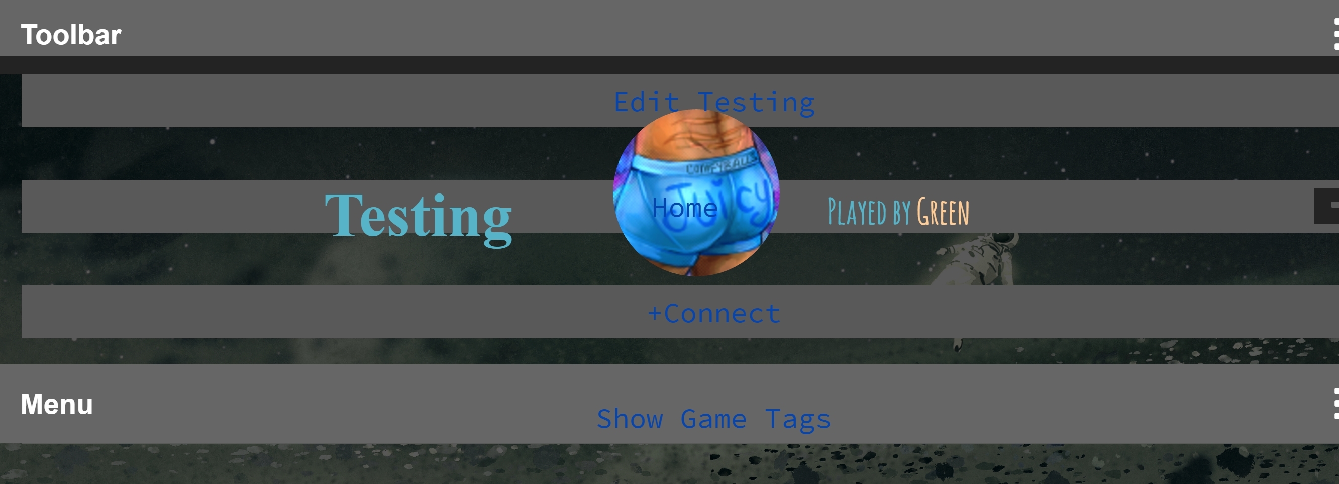
Dropdowns appears behind the content and header:
http://www.rprepository.com/c/testing
What do I do wrong? How can I fix it? Is it because I suck? LOL!
I enjoy stumbling and making my way through css and pretend I know what I'm doing!
But I'm struggling sooo much with making templates properly mobile friendly.
Most of it I manage, adjusting width etcetc, but. I'm struggling like heck with the menus!
Dropdowns appears behind the content and header:
http://www.rprepository.com/c/testing
What do I do wrong? How can I fix it? Is it because I suck? LOL!

I'd said it was working for me but then realized you meant for mobile. I checked that and it's doing the same for me.

Were you following this guide? http://www.rprepository.com/help/custom-templates#384
Yeah, I just glued it all in to have an starting point LOL.
Try adding this to the bottom of your CSS:
It won't make it perfect but it should get you much closer to where you need to go.
Code:
@media screen and (max-width: 900px) {
.mobilesupportenabled ul#pagetabs {margin-top: 0;}
.mobilesupportenabled ul#pagetabs li {
margin-top: 0;
padding-top: 0;
margin-bottom: 0;
}
.mobilesupportenabled div#charcontent {
width: 100%;
float: none;
clear: both;
}
.mobilesupportenabled div#charheader {
float: none;
width: 100%;
height: auto;
}
.mobilesupportenabled #sitecontainer, .mobilesupportenabled #header-and-content-container {
min-width: auto;
}
.mobilesupportenabled #footer {width: 100%; float: none;}
}
It won't make it perfect but it should get you much closer to where you need to go.
OH! That made it much easier!
Now I've gotten it almost where I want it, but it's matter of adjusting my original code I think and go over to use % rather than px.
Thank you so much !
!
Now I've gotten it almost where I want it, but it's matter of adjusting my original code I think and go over to use % rather than px.
Thank you so much
!
One trick I like is to declare a width, and a max-width of 100% or 90% or so.
That way, on big screens, your max-width will be used, but if there is ever not enough space for that max width to happen, it'll automatically resize to cope.
The other thing to remember is that if you use the selector .mobilesupportenabled in front of anything that is going to be in effect for mobile, it will make your template ONLY resize for small screens for people who have that option checked in their settings. People who want to see full screen all the time will still get to see full screen all the time.

I suggest you use 'em' or '%'. It works better for when making themes for mobile. Also, 'em' is just a different percentage of the screen. And I've worked with media queries a lot. So, if you have a question I can probably answer it.
You are on: Forums » Help » CSS: What do I do wrong?
Moderators: Mina, Keke, Cass, Auberon, Claine, Ilmarinen, Ben, Darth_Angelus