-
Getting started making styles
So, you've seen some neat and cool styles and want to make your own, but you don't know where to get started? We're here to help!
Before we dive into the thick of it, here are some helpful resources to read up on first. Having a basic understanding of what HTML and CSS are will go a long way in aiding the creation of your own styles.
- What is HTML?
HTML is the equivalent of a foundation, walls, windows and door frames in a house. It's the bare bones structure that all the content exists in. - What is CSS?
CSS is the equivalent of adding flooring, wallpaper, curtains and doors in a house. It's the decoration of the structure and the text and images are your furniture and decorations. - RPR's primer on custom styles
When we create styles on RPR, we cannot touch the foundational structures. We do not touch HTML (because we can't). The only thing we can do is create CSS, and tell each piece of HTML what it needs to look like.
Getting familiar with just the CSS can be daunting. There's a lot of CSS to make this group look the way it does! Fortunately, we have some helpful tools to get us started, and I'm going to share some of my tips and tricks with you along the way.")
My first recommendation is to pick an official RPR style (the ones you can use for free without requiring Epic Membership) and modify it.
To do so, simply follow the RPR primer's instructions on creating your own style, and pick "Easy mode". Choose your style to modify, and play around with the colors and fonts. Whenever you're ready to play with the CSS itself, convert the style to an Advanced style and take a look at what lies within! You can't mess up anything beyond repair, so feel free to play around changing colors directly in the code. If you do mess up? Just delete the style and re-do these steps to create a new, clean base to play with. - What is HTML?
-
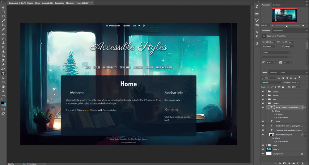 Screenshot of this group's style design in Photoshop
The design features a background heavy in blue colors, a window looking out into a cold, snowy day. The window sil is cluttered with books and pillows, and orange lamps.
Screenshot of this group's style design in Photoshop
The design features a background heavy in blue colors, a window looking out into a cold, snowy day. The window sil is cluttered with books and pillows, and orange lamps.
-
When you first get started, don't worry about polishing your designs too much in the art program. Our goal is to make it look pretty on the site, it's okay if it's not exactly what you want as an image! It's very common for my designs to not look the same as the end results, because I realize along the way I don't like an element after all, or maybe it just isn't working out.
Remember, the design is here to support your style journey and make it easier to get a foundation going.") It's not your ultimate style goal.
It's not your ultimate style goal.
Some extra pointers for designs:
- Avoid confusing yourself by naming your layers and keeping them grouped in folders.
- Limit yourself to 3 Google fonts at any given time. This is RPR's max allowance for fonts. It can be a good idea to have a separate font for titles, navigation menus and main content.
- For your initial style designs, I recommend sticking with one image - your background. Don't worry about using fancy graphics for headers and whatnot!
- I also recommend keeping your layout for your first styles ordered as follows:
- Top toolbar
- Character icon
- Character name
- Played by user
- Main navigation links
- Page title
- Widget title
- Main content
- Footer
You can get more creative with putting things into different order after being more familiar with the basics. - Save your file often, and save it in such a way the layers are preserved. Having the layer separated allows you to grab colors and play with the design at a later date without having to start over.
-
Before we get started...
I want to make sure we have a basic understanding of CSS before we start creating a new style. RPR also has some extra options for making our own styles.
CSS code is applied from the top down, always.
This means the browser starts reading the CSS at the top, and works its way down to the bottom. If you style #charheader near the top, and then override the #charheader near the bottom, only the code in the bottom will count if it already exists near the top. For example, if you set the background in #charheader at the top to white, and then tell the code to change the background in #charheader at the bottom to black, the black overrides the white at all times.
This is very important to remember when you're writing CSS code, and you should double check you're not overriding code by accident if your changes aren't updating correctly. I also recommend keeping your code relatively organized by grouping the code from top to bottom as it appears in your style, e.g. the toolbar code is near the top, followed by the portrait code, character name and played by headers, followed by the navigation menu etc. It will help a lot to avoid accidental overrides.
Add comments to your code to help your future self out!
Too many times in my coding and programming career have I run into the issue of creating something awesome, forgetting about it for a few weeks or months, and coming back to code that leaves me contemplating my entire existence because I've NO idea what this piece of code was intended to be doing.
Adding comments to your code is a great way to help your future self out by reminding you why this piece of code is here, and what you intended to do with it (and if you want to pursue a career in this field, it's also a most excellent foundation to work effectively in a team of coders!). Here's an example of some code from one of my Epic styles:
Code:html, body { background:#fff url("https://static.rprepository.com/storage/uploads/characterstyles/cs-7738-1669312477.jpg") no-repeat center bottom fixed; background-size:cover; margin:0; padding:0; width:100%; color:#523d2f; font-size:18px; font-weight:normal; font-family: 'Assistant', 'Times New Roman', sans-serif; } #sitecontainer { width:100%; margin:0; padding:0; } /* Enable columns support .row {clear: both; margin-bottom: 2rem;} .rows { margin: 0 40px;} Note to self: these two lines interfered with the layout so they were commented out. In case any column specific issues pop up, enable these and see if it fixes them! */ .row_end {clear:both;} ul.widgets {list-style-type: none; padding: 0; margin: 0;} .col-11,.col-10,.col-9,.col-8,.col-7,.col-6,.col-5,.col-4,.col-3,.col-2,.col-1 {float: left; padding-right: 15px; padding-left: 15px; box-sizing: border-box;} .row-interior > div:first-child {padding-left: 0;} .row-interior > div:last-child {padding-right: 0;} .col-1 {flex: 0 0 8.3333333333%; width: 8.3333333333%;} .col-2 {flex: 0 0 16.6666666666%; width: 16.6666666666%;} .col-3 {flex: 0 0 24.9999999999%; width: 24.9999999999%;} .col-4 {flex: 0 0 33.3333333332%; width: 33.3333333332%;} .col-5 {flex: 0 0 41.6666666665%; width: 41.6666666665%;} .col-6 {flex: 0 0 49.9999999998%; width: 49.9999999998%;} .col-7 {flex: 0 0 58.3333333331%; width: 58.3333333331%;} .col-8 {flex: 0 0 66.6666666664%; width: 66.6666666664%;} .col-9 {flex: 0 0 74.9999999997%; width: 74.9999999997%;} .col-10 {flex: 0 0 83.333333333%; width: 83.333333333%;} .col-11 {flex: 0 0 91.6666666663%; width: 91.6666666663%;} .col-12 {width: 100%;}
Not only do I designate where a new section of code begins, I also reminded myself that I commented out this code because the padding was messing with the existing padding on the content areas of the style. But this code also helps enable columns, so if I'm ever trying to fix something and I suspect padding is related, I should remember I commented out this bit of column support for this reason.
Commenting out CSS should look like this:
Code:/* Open with a forward slash, add an asterisk, write your comment. You can hit enter as often as you like, and even include CSS code in a comment! #charheader { background:none; } Because this piece of code falls inside the slash and asterisk wrapper, it won't be used by the browser. It's a helpful way to experiment with code without having to erase and re-add it repeatedly. :) You finish your comment by doing the reverse: add an asterisk, and finish with a forward slash. */
It's exceptionally helpful and it can save you a lot of headaches and frustration long-term.