-
Working from a design
 Screenshot of the tutorial character style design in Photoshop
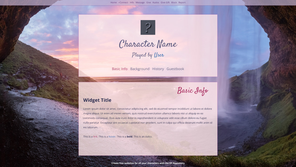
The design features a beautiful waterfall background saturated with pink, purple, blue and accents of orange and yellow. The content is divided in two semi-transparent boxes.
Screenshot of the tutorial character style design in Photoshop
The design features a beautiful waterfall background saturated with pink, purple, blue and accents of orange and yellow. The content is divided in two semi-transparent boxes.
-
In this tutorial we will be working from an existing design, which you can download for Photoshop or GIMP if you're interested in seeing the design process itself. You do NOT need Photoshop or GIMP to follow this tutorial! However, if you want to make changes to the tutorial style such as a different background image or different colors, having a basic image editing program is helpful.
Download the file here.
I designed this style primarily to be easy to code, and easy to adjust without needing to do lots of flips and tricks to make it happen. If it feels a bit basic, that is why.") Once you are more familiar with CSS you can explore more cool variations on styles and get way more fancy, but for a tutorial we want to stick to all the basics.
Once you are more familiar with CSS you can explore more cool variations on styles and get way more fancy, but for a tutorial we want to stick to all the basics.
For clarity's sake: you are allowed to copy everything exactly as-is from this tutorial and use it as a style for yourself. The image credit for the image being used belongs to Andrey Andreyev.
Before we begin the tutorial, make sure you have the following:
- The image you want to use. Resize it to 1920*1080, save it as a high quality .JPG, and then run it through TinyPng to reduce the filesize. My background image went from 1.6MB to only 359KB! If you want to use the image I used in the design, download it here and upload it under the 'Hosted Media' tab.
- Have a character profile you can test on! The more widgets your character profile has, the better.
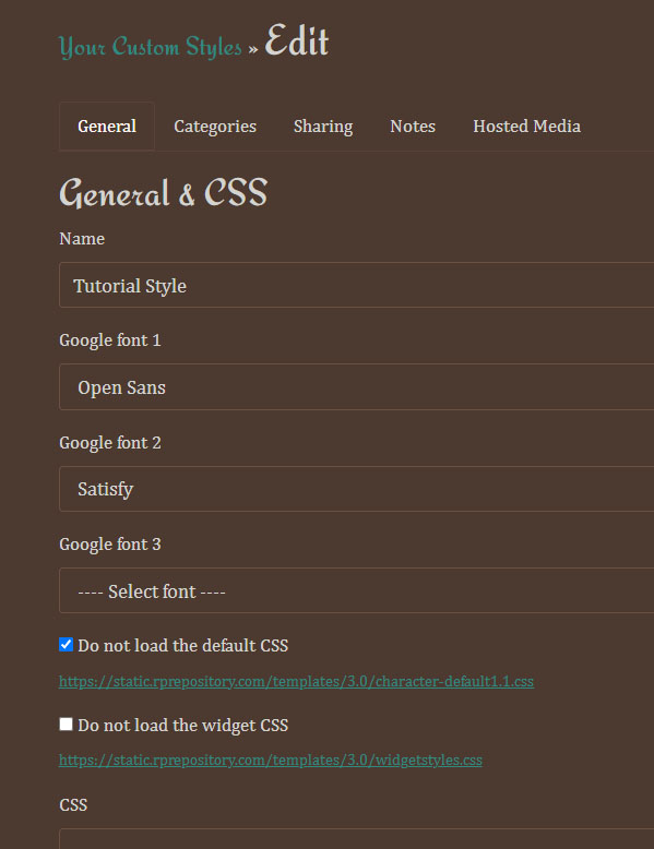
- Create a new style, give it a name and select the proper fonts. Make sure to check "Do not load the default CSS" (we do this to make it easier to get the look we want, as otherwise we would be overriding lots of existing code). It should look like this:
-
 Screenshot of the custom styles editing page
It shows the tabs "General", "Categories", "Sharing", "Notes', and "Hosted Media". Beneath is an input form with the style name Google Fonts, and checkboxes to not load default and widget CSS. The 'do not load default CSS' box is checked.
Screenshot of the custom styles editing page
It shows the tabs "General", "Categories", "Sharing", "Notes', and "Hosted Media". Beneath is an input form with the style name Google Fonts, and checkboxes to not load default and widget CSS. The 'do not load default CSS' box is checked.
-
As I mentioned before, we will be working the code top to bottom from the design. I can't explain every single line of CSS coding, so make sure to have W3Schools up in a tab to find out what the code does.
If this is your first time ever touching CSS, I recommend copying the sections as you go along and watching the magic happen as the code is being saved and previewed.") While it doesn't teach you CSS directly, you can study the code and see what ended up happening to get an initial feeling for it all.
While it doesn't teach you CSS directly, you can study the code and see what ended up happening to get an initial feeling for it all.
-
Toolbar styling
Now we start with the toolbar styling!
#toolbar tells the browser to add a background color, a border on the bottom, style our text and ensure we apply some padding. The padding is written in shorthand (check the link to learn about shorthand). Our background color here is semi-transparent, so we use the rgba(a,b,c,x) color code. The rgb for HEX code #c3b2d1 is R195 G178 B209 which you can usually find in an image editing program. We want 70% transparency, which is 0.7. Thus, rgba(195,178,209,0.7)!
Next we style the links inside the toolbar. We also make sure that all the links are displayed inline (next to each other) instead of blocked (stacked on top of each other). Feel free to change display:inline; to display:block; to see the difference!
Finally we apply some final margins and paddings to the list itself, and create some space between the + icon and the text (designated as .fa, .fas).
Now, if we left it like this the dropdown menu in the toolbar would show, but it wouldn't be very nice! So we make sure to tell the code to not show the dropdown until we hover over it: #toolbar-dropdown-nav will have display:none;, and we will change the display when we hover over it.
The link we're hovering over is inside <li id="toolbar-nav">, so when we hover over this ( li#toolbar-nav:hover ) we select its children that are ( ul#toolbar-dropdown-nav ). It helps to look at the HTML structure to understand the relationship. (If this is SUPER confusing right now, don't worry! It really is. Selectors still turn my brain noodles into absolute mush, but feel free to read up on them here. The important thing is that this code rarely needs to change, so you can just copy and paste it and simply change the colors and borders as needed!)
As a final step, we don't want the links inside a dropdown to be inline (next to each other), so we apply display:block; to stack them.
Display the codeCode:/* Toolbar */ #toolbar { width:100%; margin:0; padding:5px 0; text-align:center; background:rgba(195,178,209,0.7); color:#603178; font-size:14px; border-bottom:1px solid #603178; } #toolbar a, #toolbar a:active { color:#603178; text-decoration:none; padding:5px; margin:2px; } #toolbar a:hover { color:#241e99; } #toolbar ul > li, #pagetabs li { display:inline; } #toolbar ul { margin:0; padding:5px 0; } .fa, .fas { padding-left:5px; } /* Toolbar dropdown */ #toolbar-dropdown-nav { display:none; } li#toolbar-nav:hover > ul#toolbar-dropdown-nav { display: block; background:rgba(195,178,209,1); border:1px solid #603178; border:0; margin-top:4px; border:1px solid #603178; } #toolbar-dropdown-nav a { padding: 5px; text-decoration: none; display: block; text-align:left; }
-
Character header styling
We start the header styling by setting the left and right header side to display:none;. These can be useful in certain designs, but we don't need them here!
Next we set the #charheader itself and make it pretty; we set a max-width of 900 pixels because that's going to be the size of our content area throughout the design. We give it a background color, a border, align the text to the center and give the text inside a color. We also give it margins. Just like with the padding, we use shorthand code here. We want it 45 pixels from the top to create some space, center it left and right, and have no margin on the bottom. We do NOT use padding here. If we pad the inside of this element, it will make it bigger. For example, padding 50px left and padding 50px right will add a total of 100 pixels width to the element. Since we want it to be 900 pixels wide max, we need to add any necessary margins or padding to the elements inside the #charheader instead.
We do something similar margin-wise with the profile icon! We want it centered, 35 pixels from the top, and no margin on the bottom.
Then it's time to format the character name and played by text. Since these two ids share the same font-family and font-weight, we combine them into one section. Then we change their font-size and margin separately. We want to retain most of the native margins here, but move the text closer together, so we remove the margin-bottom from the character name, and we remove the margin-top from the played by text.
Finally, we change the link color of the username link as well as the link hover!
Display the codeCode:/* Character Header */ #leftheaderside, #rightheaderside { display:none; } #charheader { max-width:900px; background:rgba(255,231,233,0.8); border:1px solid rgba(165,48,169,0.8); margin:45px auto 0 auto; text-align:center; color:#5c5a80; } #charheader .portraitcontainer img { margin:35px auto 0 auto; } #characterName,#playedBy { font-family:'Satisfy', 'Garamond', sans-serif; font-weight:normal; } #characterName { font-size:60px; margin-bottom:0; } #playedBy { font-size:36px; margin-top:0; } #playedBy a { color:#2b69af; text-decoration: none; } #playedBy a:hover { color:#a7235a; }
-
Navigation styling
The navigation is wrapped inside the #charheader, so all we really have to do is give it some colors, margin and padding and make sure the dropdown works.
This should be pretty familiar after styling the toolbar! The new addition here is the .currentPage styling: we're giving the currently viewed page its own color in the navigation so it's easier for the user to remember which page they're on. We give this the same color as the link hover for pagetabs.
In the dropdown, we're also making the font of links smaller, and making the links bold. It helps to make dropdowns feel less crowded, but it's a personal choice!
Display the codeCode:/* Navigation */ ul#pagetabs { margin: 50px 0 30px 0; } #pagetabs a, #pagetabs a:active { color:#5c5a80; font-size:20px; text-decoration: none; padding:5px; } #pagetabs .fa, #pagetabs .fas { font-size:16px; padding-left:0; } #pagetabs a:hover, #charheader .currentPage > a { color:#a7235a; } /* Dropdown */ .pagetab ul li a{ display: block; padding:0; margin:0; } ul.nestedPages { position: absolute; padding: 0; margin-top: 0px; } ul.nestedPages.open-dropdown { text-align:left; margin-top:10px; background:rgba(255,231,233,0.8); border:1px solid rgba(165,48,169,0.8); } #charheader ul.nestedPages a { font-size:16px; padding:15px; font-weight:bold; }
-
Content styling
Now this is where things get a bit more complicated and extensive: styling the main content area where all your character's information is on display!
We start by (once again) styling the box the content is inside. Like the character header, we use the same styling for the background and border. We apply margins to push the content area bown and separate it from the header, and we add some padding at the bottom. This makes the box longer, but that's not a problem in our design here.
Then we style the page and widget titles. In our image design, the page title is alinged right and has its own font styling. We don't want it stuck all the way to the border on the right, so we add a margin-right to create some space.
Then we style the links. Here is where things can get a bit tricky: we didn't load the default CSS, so our style is missing commonly used things like quotes, spoilers, code sections, and some formatting fixes.
Now here's the caveat: I didn't include styling for every element you may be using. Most of them don't need anything special to function, but if you DO run into one that isn't working properly... why not try to fix it up? If you get stuck, just ask on the forum!
Display the codeCode:/* Character Content */ #charcontent { max-width:900px; background:rgba(255,231,233,0.8); border:1px solid rgba(165,48,169,0.8); margin:45px auto 0 auto; padding-bottom:30px; } h2.pagetitle { color:#a7235a; font-family:'Satisfy', 'Garamond', sans-serif; font-size:48px; text-align:right; margin-right:75px; font-weight:normal; } h3.widgetTitle { font-size:30px; font-weight:bold; } a, a:active { color:#a7235a; text-decoration: none; } a:hover { color:#2b69af; } /* Markup and widget specific things. Since we're not using the default CSS we need to make some things happen here. */ /* Spoilers */ .bbcode_spoiler { color:#5c5a80; background:#5c5a80; cursor:pointer; } .bbcode_spoiler.revealed { color:#2b69af; background:none; } /* Quotes and code boxes */ .bbcode_quote, .bbcode_code { border:1px solid #5c5a80; margin:20px auto 20px auto; } .bbcode_quote_head, .bbcode_code_head { border-bottom:1px solid #5c5a80; background:#e1b9d1; padding:10px; } .bbcode_quote_body { padding:10px; } .bbcode_code_body { overflow-x: scroll; padding:10px; } /* Some fixes to ensure the Style behaves correctly in specific areas */ .widget-clear { clear:both; } .mobiletabletonly { display:none; }
-
Footer styling
The footer is probably the easiest part here. All we're doing is centering the text inside the #footer div, and then formatting the link itself.
Additionally, we can add a credit with a pseudo-element. Handy dandy for credits, and fully customizable!
Display the codeCode:/* Footer */ #footer { text-align:center; } #footer a { color:#fff; font-weight:bold; font-size:14px; } /* Do you want to add a credit to your style? You can do that this way easily: */ #footer p::after { display:block; content:'Tutorial Style made by Sanne & You'; color:#fff; font-size:12px; }
-
Preparing for Mobile
WHEW! You just put together a whole basic style, congrats!! At the bottom of this page you will find the code in full, but I hope copy and pasting the code piece by piece was a helpful experience.
Now that we have the basic design ready and in action, it works really well on a desktop PC, and possibly even on some larger tablets without any issues. But part of our goal here is to make an accessible style, and that means including a mobile version! Fear not, I'll walk you through that as well before you know it. For now, please make the style look the way you want it to with the image, colors and fonts. When that is done, feel free to proceed to the mobile responsive tutorial.
Show me the whole style code in full please!Code:html, body { background:#7b98d2 url("https://static.rprepository.com/storage/uploads/characterstyles/cs-7761-1670122710.jpg") no-repeat center bottom fixed; margin:0; padding:0; width:100%; color:#23264b; font-size:16px; font-family: 'Open Sans', 'Verdana', sans-serif; font-weight:normal; } #sitecontainer { width:100%; margin:0; padding:0; } /* Adding columns support */ .row { clear: both; margin-bottom: 2rem; } .row_end { clear:both; } .rows { margin: 0 40px; } ul.widgets { list-style-type: none; padding: 0; margin: 0; } .col-11,.col-10,.col-9,.col-8,.col-7,.col-6,.col-5,.col-4,.col-3,.col-2,.col-1 { float: left; padding-right: 15px; padding-left: 15px; box-sizing: border-box; } .row-interior > div:first-child { padding-left: 0; } .row-interior > div:last-child { padding-right: 0; } .col-1 { flex: 0 0 8.3333333333%; width: 8.3333333333%; } .col-2 { flex: 0 0 16.6666666666%; width: 16.6666666666%; } .col-3 { flex: 0 0 24.9999999999%; width: 24.9999999999%; } .col-4 { flex: 0 0 33.3333333332%; width: 33.3333333332%; } .col-5 { flex: 0 0 41.6666666665%; width: 41.6666666665%; } .col-6 { flex: 0 0 49.9999999998%; width: 49.9999999998%; } .col-7 { flex: 0 0 58.3333333331%; width: 58.3333333331%; } .col-8 { flex: 0 0 66.6666666664%; width: 66.6666666664%; } .col-9 { flex: 0 0 74.9999999997%; width: 74.9999999997%; } .col-10 { flex: 0 0 83.333333333%; width: 83.333333333%; } .col-11 { flex: 0 0 91.6666666663%; width: 91.6666666663%; } .col-12 { width: 100%; } /* Toolbar */ #toolbar { width:100%; margin:0; padding:5px 0; text-align:center; background:rgba(195,178,209,0.7); color:#603178; font-size:14px; border-bottom:1px solid #603178; } #toolbar a, #toolbar a:active { color:#603178; text-decoration:none; padding:5px; margin:2px; } #toolbar a:hover { color:#241e99; } #toolbar ul > li, #pagetabs li { display:inline; } #toolbar ul { margin:0; padding:5px 0; } .fa, .fas { padding-left:5px; } /* Toolbar dropdown */ #toolbar-dropdown-nav { display:none; } li#toolbar-nav:hover > ul#toolbar-dropdown-nav { display: block; background:rgba(195,178,209,1); border:1px solid #603178; border:0; margin-top:4px; border:1px solid #603178; } #toolbar-dropdown-nav a { padding: 5px; text-decoration: none; display: block; text-align:left; } /* Character Header */ #leftheaderside, #rightheaderside { display:none; } #charheader { max-width:900px; background:rgba(255,231,233,0.8); border:1px solid rgba(165,48,169,0.8); margin:45px auto 0 auto; text-align:center; color:#5c5a80; } #charheader .portraitcontainer img { margin:35px auto 0 auto; } #characterName,#playedBy { font-family:'Satisfy', 'Garamond', sans-serif; font-weight:normal; } #characterName { font-size:60px; margin-bottom:0; } #playedBy { font-size:36px; margin-top:0; } #playedBy a { color:#2b69af; text-decoration: none; } #playedBy a:hover { color:#a7235a; } /* Navigation */ ul#pagetabs { margin: 50px 0 30px 0; } #pagetabs a, #pagetabs a:active { color:#5c5a80; font-size:20px; text-decoration: none; padding:5px; } #pagetabs .fas { font-size:16px; padding-left:0; } #pagetabs a:hover, #charheader .currentPage > a { color:#a7235a; } /* Dropdown */ .pagetab ul li a{ display: block; padding:0; margin:0; } ul.nestedPages { position: absolute; padding: 0; margin-top: 0px; } ul.nestedPages.open-dropdown { text-align:left; margin-top:10px; background:rgba(255,231,233,0.8); border:1px solid rgba(165,48,169,0.8); } #charheader ul.nestedPages a { font-size:16px; padding:15px; font-weight:bold; } /* Character Content */ #charcontent { max-width:900px; background:rgba(255,231,233,0.8); border:1px solid rgba(165,48,169,0.8); margin:45px auto 0 auto; padding-bottom:30px; } h2.pagetitle { color:#a7235a; font-family:'Satisfy', 'Garamond', sans-serif; font-size:48px; text-align:right; margin-right:75px; font-weight:normal; } h3.widgetTitle { font-size:30px; font-weight:bold; } a, a:active { color:#a7235a; text-decoration: none; } a:hover { color:#2b69af; } /* Markup and widget specific things. Since we're not using the default CSS we need to make some things happen here. */ /* Spoilers */ .bbcode_spoiler { color:#5c5a80; background:#5c5a80; cursor:pointer; } .bbcode_spoiler.revealed { color:#2b69af; background:none; } /* Quotes and code boxes */ .bbcode_quote, .bbcode_code { border:1px solid #5c5a80; margin:20px auto 20px auto; } .bbcode_quote_head, .bbcode_code_head { border-bottom:1px solid #5c5a80; background:#e1b9d1; padding:10px; } .bbcode_quote_body { padding:10px; } .bbcode_code_body { overflow-x: scroll; padding:10px; } /* Some fixes to ensure the Style behaves correctly in specific areas */ .widget-clear { clear:both; } .mobiletabletonly { display:none; } /* Footer */ #footer { text-align:center; } #footer a { color:#fff; font-weight:bold; font-size:14px; } /* Do you want to add a credit to your style? You can do that this way easily: */ #footer p::after { display:block; content:'Tutorial Style made by Sanne & You'; color:#fff; font-size:12px; }