Posted by Kim on February 3, 2016, 2:30pm
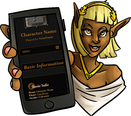
All 167 official templates have been updated, modernized, and finally support small screen devices!
Amazingly, only two templates had to be retired during this process: The scroll box versions of the orchid templates.
Amazingly, only two templates had to be retired during this process: The scroll box versions of the orchid templates.
If any of your characters were using a scroll box orchid template, they've been transitioned to using the non-scroll box version.
You may notice that some of your favorite templates look slightly different, whether it's a modified width or an easier to read text color. Every template has had multiple issues addressed, and been made more robust to stand up to all the wildly varying ways people set up their profiles, the different ways people try to view them, and the many things that used to go wrong along the way.
Now that our existing templates are up to snuff, you'll start to see new templates arriving again! (*cough* epic week *cough*)
As you know, with any major update there is a risk that new bugs have found their way in. Please help make our new templates flawless! If you run into trouble, big or small, please submit a bug report so I can fix it for you and everyone ASAP.
")
Edit: Please please please remember to include a link to where you're seeing the issue! Often, special circumstances of some kind are involved, and I need to see a real live malfunction to efficiently address it.
Comments

These look great now! I just prowled through a few while on mobile.

For those of you working with columns, I just pushed some changes that will make them slightly more reliable on mobile views.
Which is not to say they aren't still the ugly step child of BBCode. We'll have to do more with them down the road, for sure.
Which is not to say they aren't still the ugly step child of BBCode. We'll have to do more with them down the road, for sure.

Pfft. The funny thing is that I was just reading a couple profiles on the community characters section when I suddenly came upon this new format. I was like "Whoa.. Not totally glitchy like before.. and it looks good too. What did I do?" Then I read the homepage and was quite happy to see I wasn't just insane.
@Rigby - Link please?

(And yeah, columns are kind of wonky on the handful of mine that use it - but that is more of a look thing. Text-by-text seems to work fine across the mobile things I have. Pictures snarl things up a little so far by nudging them right out of the template. I'll adapt!)
@Kitom - Are you talking about BBCode columns?
Tate

February 3, 2016
2:49pm
Thank you so much for increasing legibility! I already have such a hard time with how tiny people make their text, it's good the colours don't blend anymore, at least!
Those mobile page-tab menus are lifesavers for drop-down boxes, these are great so far!

Not really a bug but I think side by side columns kinda cause it to tweak a little by making the text wider than the background. Like I said not really a bug so much as an aesthetic tweak lol
@Claine - I believe so, for those intrepid souls who are not afraid to use their CSS inspectors. It'll be a bit later in the month before I'm able to put together a complete guide as to how to utilize all the mobile features.

Yeeeesss! I'm so glad to see this. I'd the feature for mobile page tabs available for custom theme makers?
Kim
February 3, 2016
3:30pm