
Different fonts is probably not in our near future, I fear! Though I do have an eye toward special dyslexia-friendly fonts as our first possibilities for something like that.

History in the making. Also can the large size font be called "jumbo" please. Just wondering.
I also just want to say, thank you so much for the really specific requests and examples; I'd definitely seen people saying the dark theme was "bad" or "too bright," but I didn't really understand what that meant, as to me it looked quite dark, and the theme is actually very popular. This topic helped me to grok what exactly was needed for people who didn't like existing dark theme, and the timing on it happened to be great too ")
I'm sure someone has given me hints about what was needed before, but this is the first time I got it
I'm sure someone has given me hints about what was needed before, but this is the first time I got it
sland wrote:
History in the making. Also can the large size font be called "jumbo" please. Just wondering.
Now I kind of feel like we need to announce a new Jumbo size on April Fools and have it be ridiculous huge.

Do the current experimental options line up with the BBcode defaults? That is:
the help page wrote:
This text is size 2 (small).
This text is size 3 (normal).
This text is size 4 (large).
This text is size 5 (very large).
This text is size 3 (normal).
This text is size 4 (large).
This text is size 5 (very large).
The new font sizes are just a percentage on the default font size. The BB code font sizes are also based on percentages, so the BBcode sizes should adjust pretty dynamically with whatever font size you choose overall. Is that the question?

Out of curiosity, how will in-text size coding be affected by the account settings for text? Mainly wondering because I'm amused by the idea of someone having their text set to 'larger', only to code their post text to be big too. Would it take up the entire screen?
Edit: Oops. Ninjaed.
Edit: Oops. Ninjaed.
You can definitely make some very prominent titles in your text with the larger font option turned on!
At the risk of going off-topic I just wondered if the percentages lined up. In settings as in BBcode, the step from Small>Default seems wider than Default>Large, same with how 2>3 seems like a bigger gap than 3>4. Could always be my imagination.
For BBcode:
Size 2 is x 0.83,
Size 3 is 1 (default size),
Size 4 is x1.17
Size 5 is x1.5
Size 6 is x2
Size 7 is x2.5
So yeah, they don't always go up or down steadily.
For the font sizes in options (currently, could change or be expanded on):
Small is x0.9,
Large is x1.10
Larger is x1.3
So, if you choose the larger font size, and then look at some size 7 font size, that font will be multiplied by 1.3 and then again by 2.5. This shooooould mean that author's intent is more or less preserved, even if their specific word wraps aren't; it will be obvious what they meant to make really stand out or use as a title vs what's just body text, for example.
I hope I understood the questions this time!
And just in case people are wondering...I've looked over several of my character profiles and compared the impact that changing the account setting text size has, and everyone should be glad to know that it doesn't mess up your profile formatting. It fortunately seems like those are kept separately, so worrying about 'if I code my profiles with a different text size enabled, will it ruin my profiles?' isn't necessary.
Yeah, site themes and font sizes exclusively effect the main site, not people's personal "character sites" or groups.
Probably at some point we will acquire a setting to override group/character styles for people who don't want to see pretty, they just want to see easily readable info.
Probably at some point we will acquire a setting to override group/character styles for people who don't want to see pretty, they just want to see easily readable info.

its funny I actually set my profile up with grey text to the black background because it made it so much easier for me to read, like I did everything on my profile for my own readability lol
I do hope it's easy enough for other's to read as well
I do hope it's easy enough for other's to read as well

Not to come in late on this, but I did put together a greyscale RPR a while back.
Hey gang,
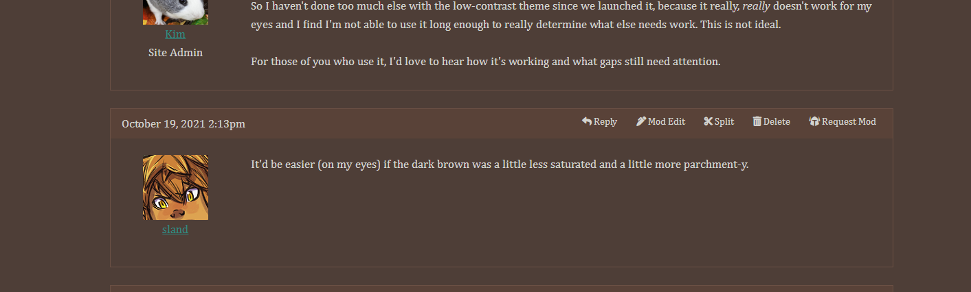
So I haven't done too much else with the low-contrast theme since we launched it, because it really, really doesn't work for my eyes and I find I'm not able to use it long enough to really determine what else needs work. This is not ideal.
For those of you who use it, I'd love to hear how it's working and what gaps still need attention.
It'd be easier (on my eyes) if the dark brown was a little less saturated and a little more parchment-y.

sland wrote:
It'd be easier (on my eyes) if the dark brown was a little less saturated and a little more parchment-y.
sland wrote:
It'd be easier (on my eyes) if the dark brown was a little less saturated and a little more parchment-y.
Before I make universal changes, let me make sure I'm understanding...
Do you mean if the background color for lower contrast went from the current #4c3930 to, say, a #4e3e37 ?
And maybe the forum post background went from #43322a to maybe a #483932 ?
Hopefully this screenshot works to demonstrate what the difference would be...
To me, I would prefer a slightly darker brown to have more distinction from the border areas, but not as dark as it currently is.
Edit: looking at it in more detail aka not on my phone, I think that combo works well!
Edit: looking at it in more detail aka not on my phone, I think that combo works well!
You are on: Forums » Suggestions & Development Discussion » Astigmatism Friendly Theme (ADDED)