Posted by Kim on March 20, 2013, 10:50am
Today, we present Jane's final tutorial on taking your character profiles to the next level.Check out the first and second tutorials, and then dive in to this chapter on giving some final polish to how text and information is presented on your profiles.
How to make your profile look clean and neatly aligned
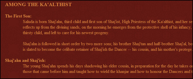
Saluda (played by Hooke) uses simple bolded text to create section titles, then makes use of the indent tag to create simple, clean, understandable-at-a-glance sections on his profile.
Your profile is already pretty, but you want that final touch to make it look very clean and orderly?
You might want to align the text as blocktext, meaning all your sentences will extend to both sides of the page, using this:
Code:
[justify] text goes here [/justify]
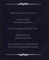
The Vessel (played by Hooke) uses a combination of centered text, italics, and bolded first letters of each line to create a poetic introduction. Plus, check out the use of images as tasteful dividers!
Don't use the same size for your text on your whole site.
This looks plain and makes it hard to read. Some important points or words should be emphasized to lead the eye through the profile. Less important information can be made smaller so people can read it if they want, or skip it if they are looking for the main points.
The code for changing the size of your text is:
Code:
[size=2] text goes here [/size]
You can use numbers 1 through 7 when picking your size.
BBcode gives you many possibilities you can use to your advantage to make text stand out.
Code:
[b] text goes here [/b] = bold
[i] text goes here [/i] = italics
[u] text goes here [/u] = underlined
[s] text goes here [/s] = strike out
The text on your profile sticks to the top/bottom, no matter what you do?
"White space" or blank characters like enter or lots of spaces are trimmed off the beginning and end of text widgets when they are saved. If you want a way around this, insert some BBCode and do not put any text inside it, just hit enter a few times. Then this "White space" will not be at the beginning of your text, so it will not be trimmed off when you hit save.
Code:
[b][/b]
I did not put anything inside the bold tag, so nothing will appear on my profile.
But the new lines above this sentence will be preserved.
Removing the default titles from widgets
I personally use a single text-widget for my sites. However if it confuses you, you can use more.
You don't have to put text into the widget's title box. Leave it blank if you think it doesn't go well with your layout.
A neat way to organize the statistics of a char is to use columns.
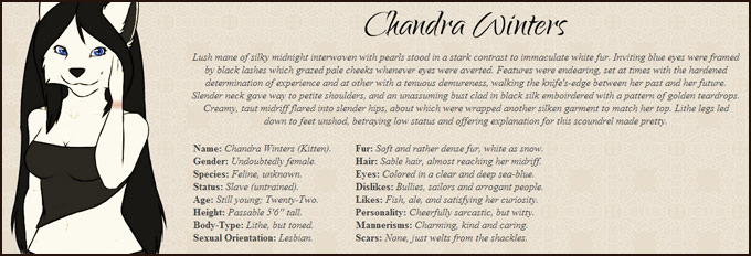
Chandra Winters (played anonymously) uses columns to organize some basic information about herself into two sections on the same line, making efficient and pleasant use of visual space.
You can find the code for the columns here.
You can use other Bbcodes in the columns too, for example the collape tag.
You will find out that the size of the columns depends on the text. This can make the columns look cluttered, because they aren't aligned the way you want them.
A solution is to create a transparent picture of a certain size.
The picture has to be just a pixel in height, and for example 250 pixels wide.
If you add that picture in the first line of every column, they will all have the same size.
Different screen resolutions
If your profile looks all pretty but another user points out that some of the alignments you made are not working, it could always be that the other user is using a different resolution to view sites.
Use Ctrl + Mouse Wheel to zoom in/out, to see how the page would look in different resolutions.
Just do your best to make it look good, but if you are worried, you can include a note that informs people that they may need to try a different resolution to see your best work.
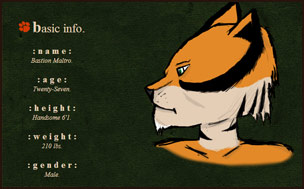
Bastion Maltro (played anonymously) uses multiple techiques to create a varied look to his text, from changing the size, adding bold and italics, and in some cases, just plain using extra spaces!
Jane has generously offered to prettify one lucky person's profile! Just leave a comment on this news post that includes the words "I am entering to win that profile." Next week, we will draw a winning name!
Only players who have not previously had Jane prettify one of their profiles may enter, to give everyone a chance to experience her talents.
Thank you Jane!
As thanks for sharing some of her tricks of the trade, Jane has been awarded a nice big shiny trophy for her profile. If you appreciate these tips too, please shower her in kudos explaining her generous and helpful spirit to the world!
Comments
TheLily

March 20, 2013
1:30pm
I am entering to win that profile.
These look so awesome, but I have to start from scratch for most of mine. When I did nis' profile I got super lazy. It's easier for me to start straight from scratch
These look so awesome, but I have to start from scratch for most of mine. When I did nis' profile I got super lazy. It's easier for me to start straight from scratch

Lovely profile. 
"I am entering to win that profile."
"I am entering to win that profile."

Yes, it can be used in every profile.
I want to thank you too Kim. Without you RPR would not exist, and without you I wouldn't have had to share the tutorials with others.
Kim, you are the best
I want to thank you too Kim. Without you RPR would not exist, and without you I wouldn't have had to share the tutorials with others.
Kim, you are the best

Nope, neato formatting is for everyone! ")

I am entering to win that profile.
Was pretty sure these kind of stuff were just 'epic member' option. Should try it someday.
Was pretty sure these kind of stuff were just 'epic member' option. Should try it someday.

I am entering to win that profile. 
I havent tried all the trick and tips shown yet but I didnt even realize you could do most of them. Rather helpful..
I havent tried all the trick and tips shown yet but I didnt even realize you could do most of them. Rather helpful..
I am entering to win that profile
I am entering to win that profile
I am entering to win that profile
I am so lazy about making finally some neat profiles for my chars, I need to start with such awesome work from you x3
I am entering to win that profile
I am entering to win that profile
I am so lazy about making finally some neat profiles for my chars, I need to start with such awesome work from you x3

They're all such lovely profiles!
I am entering to win that profile.
I am entering to win that profile.
Thank you too

I am DEFINATELY entering to win that profile!
I love how you do them Jane! I haven't edited my profiles as such yet, but I probably will in the future c: in the mean time, I hope I'm the lucky winner x'3
I love how you do them Jane! I haven't edited my profiles as such yet, but I probably will in the future c: in the mean time, I hope I'm the lucky winner x'3

I did this months ago on Quickfoot's site, because center-aligning the smaller pieces of information looked SUPER clean and went hand-in-hand with his custom template.
Ahem, but me aside!
These have been wonderful, well-explained and laid out tutorials, and I once again want to extend my thanks to Jane for these tips, to Kim for gettin' 'em out there for us to see, and to everyone who had a profile to contribute in showing everything in working order. Thanks a ton, you guys!
Ahem, but me aside!
These have been wonderful, well-explained and laid out tutorials, and I once again want to extend my thanks to Jane for these tips, to Kim for gettin' 'em out there for us to see, and to everyone who had a profile to contribute in showing everything in working order.
Thanks a ton, you guys!

Thanks Kim! And you're right, my eyes tend to skim riiiight over very tiny text and sometimes I lose out on a whole website when it is set like that. 
Using varying sizes of text through the whole website is also a really, really good suggestion. Even if you don't make headers setting different sizes that are relatively readable gives the character page a sense of depth.
One of my favourite things to do when making statistics is to bold them and put the all in UPPERCASE and use font size 2 while keeping the information filled in for the stats regular sized. It doesn't look like much be it adds a little extra that goes a long way.
Example:
NAME: Dylan
AGE: 25
GENDER: Female
OCCUPATION: Being Awesome
Thank you for showcasing all these wonderful profiles! It has also given me a chance to check out some characters I haven't seen before. These tutorials have been very informative.
That is a GREAT tip, Dylan. Tiny text tends to get skipped.
It's lovely how this is laid out so its nice and easy for people to do this on their own! It's so helpful. Thanks again!
My only suggestion/recommendation for those making their websites:
Please avoid putting all the important information in font sizes 1 or 2. It is so, so difficult to read and though it may look pretty it isn't terribly practical. Even though you can set a 'zoom' in Chrome, as an example, it ends up keeping all of RPR massive and blown up.")
My only suggestion/recommendation for those making their websites:
Please avoid putting all the important information in font sizes 1 or 2. It is so, so difficult to read and though it may look pretty it isn't terribly practical. Even though you can set a 'zoom' in Chrome, as an example, it ends up keeping all of RPR massive and blown up.
Strangedisease
March 20, 2013
1:36pm
Also, I'm entering to win that profile.