Posted by Kim on February 26, 2020, 9:00am
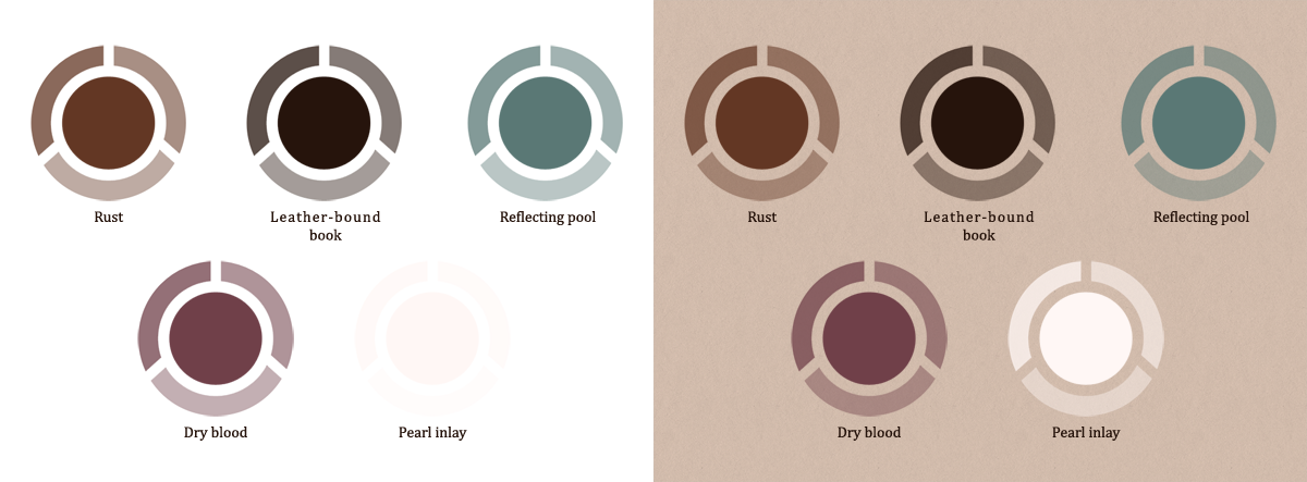
In 2011, I was working on coming up with a basic brand palette for the RPR, that I hoped would serve us long into the future. I wanted something evocative of RP, restive to read for long periods of time, and relatively color-blind friendly. I wanted it to be pretty enough, but also to form a gentle background on which RPs could be written, without calling undue attention to itself when the attention should be on the community.I eventually settled on a palette of off-white, faded teal, rusty red, and deep leather colors that made me think of old books, worn adventuring boots, and slightly tarnished metals. The "brand" also included a faintly-rose tinted piece of parchment, with burnt and torn edging. You'll no doubt recognize them, as we've been using them ever since:
(Fun design fact: We got our current logo in 2013 -- before then it was literally just the site name written in times new roman. No, seriously.)
However, in 2019, as I was rebuilding the code of the entire site, I knew it was also time for an update to our palette. In truth, I was (am!) still very happy with our basic colors, but what I really needed was some bright, attention-grabbing accent colors that DID call attention to themselves. Colors that stood out and went "ZING!" Colors that said, "HEY, CLICK ME!!!" or "AHH! DANGER WILL ROBINSON!"
They also needed to feel like part of the existing RPR palette while doing these things.
Also also: I wanted them to feel more sci-fi than fantasy.
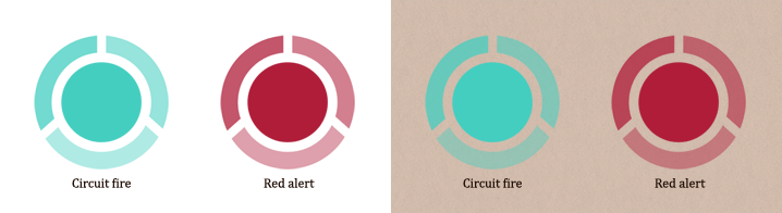
Enter circuit fire and red alert! These two evolved out of our existing colors, reflecting pool and dried blood. So much so that for awhile, "red alert" was referred to as "first blood" in my style sheet. But two blood related color names felt, well, a little blood-thirsty for us, and red alert better reflected the brighter and more futuristic feel of the color.
Here are all the colors together:
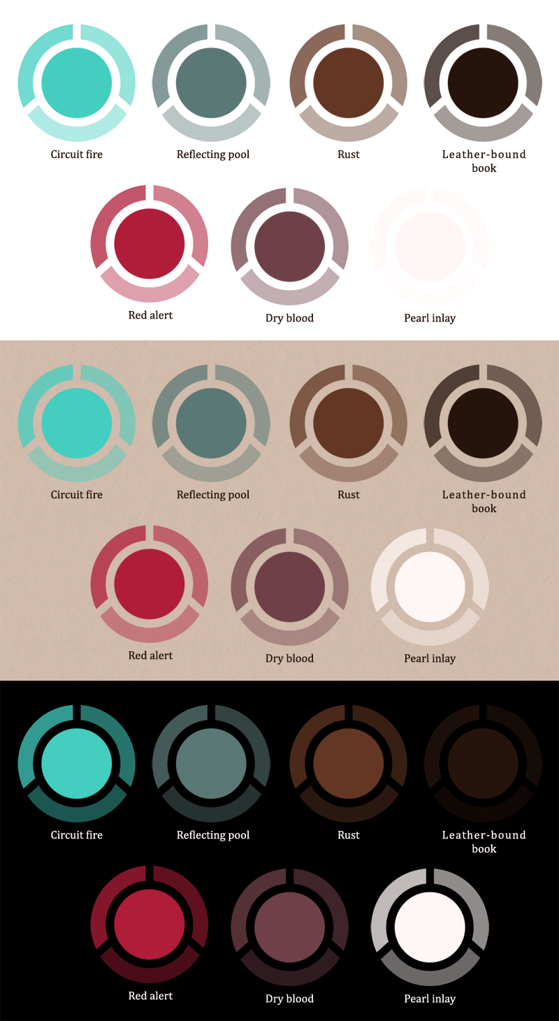
As you can see, the background they're used on makes a world of difference to how they're perceived.
Speaking of backgrounds! These additional colors gave me new design flexibility, even so far as to make it possible to add two new optional site themes -- minimal light, which utilizes pearl inlay as its background rather than our parchment texture, and dark (or "Cocoa mode" as some users have taken to calling it,) which utilizes leather-bound book as its background.
Comments

Beautiful colors!

Ooooh!! I love these!

they're pretty :>

Oooo, exciting!! I live seeing the swatches of all the colors together too.

@MissLumina You don't do anything to apply them. They are already in use on the site as accent colors. ")
MissLumina

February 26, 2020
12:31pm
I meant the new colors, Kim.
@MissLumina if you're talking about trying the new site themes, go to https://www.rprepository.com/settings/general and look under "display settings"
You can pick something other than the "classic parchment" look there
@Mipps thanks! It was a cool process, and doing this write-up to share how it came together made me just so happy
You can pick something other than the "classic parchment" look there
@Mipps thanks! It was a cool process, and doing this write-up to share how it came together made me just so happy
Mipps
February 26, 2020
12:13pm
It amazes me how much research goes into colors and the subtle effects designs have on us. This is so well thought out, Kudos to this Kim. I love it.
MissLumina
February 26, 2020
12:10pm
How do I apply these new colors?

oo Wonderful color choices! I'm trying out the dark theme now. I like it, I just need to adjust because my brain is going NEW THING, NO. That usually takes about a week to wear off.

I've always loved the palette for RPR personally, but it's cool to know so much thought was put into it.
Taciturn
February 26, 2020
9:45am
I love using the dark theme, makes it so much easier to read text when light backgrounds/dark text give you headaches.
@Juls - thanks, fixed!

Awesome! (The 'two new optional site themes' link is pointing to a test URL though!)
(The 'two new optional site themes' link is pointing to a test URL though!)
Queen_of_Hell
February 26, 2020
9:09am
So excited about this!!!
Jondrette-GirlFebruary 28, 2020
2:42pm